android实现Materia Design风格APP(三):部分Materia Design风格的控件介绍二_@bindview(r2.id.drawer_layout) drawerlayout mdrawe-程序员宅基地
技术标签: UI动画类 android Materia Design android实现Materia Design风格APP
本篇大部分内容学习自第一行代码第二版加上部分自己理解。介绍了,DrawerLayout、NavigationView、NestedScrollView、AppBarLayout、CardView、SwipeRefreshLayout、CollapsingToolbarLayout七个控件,会的请自行跳过。
首先需要在build.gradle中依赖:
implementation 'com.android.support:design:28.0.0'
implementation 'de.hdodenhof:circleimageview:2.1.0'
implementation 'com.android.support:cardview-v7:28.0.0'
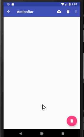
1.DrawerLayout
滑动菜单,第一个布局为主内容,第二个布局为菜单布局,可以设置两个菜单布局分别指定layout_gravity为start和end设置左右滑出不同布局的菜单。
xml布局代码:
<?xml version="1.0" encoding="utf-8"?>
<android.support.v4.widget.DrawerLayout
    xmlns:android="http://schemas.android.com/apk/res/android"
    xmlns:app="http://schemas.android.com/apk/res-auto"
    xmlns:tools="http://schemas.android.com/tools"
    android:layout_width="match_parent"
    android:layout_height="match_parent"
    tools:context=".Main2Activity">

    <android.support.design.widget.CoordinatorLayout
        android:id="@+id/root"
        android:layout_width="match_parent"
        android:layout_height="match_parent">

        <!--定义theme指定toolBar中的子view的主题,popupTheme指定toolBar隐藏的menu打开时的主题-->
        <android.support.v7.widget.Toolbar
            android:id="@+id/toolBar"
            android:layout_width="match_parent"
            android:layout_height="?attr/actionBarSize"
            android:theme="@style/ThemeOverlay.AppCompat.Dark.ActionBar"
            app:popupTheme="@style/ThemeOverlay.AppCompat.Light"
            android:background="@color/colorPrimary"/>

        <android.support.design.widget.FloatingActionButton
            android:id="@+id/fab"
            android:layout_width="wrap_content"
            android:layout_height="wrap_content"
            android:src="@drawable/ic_delete"
            android:layout_gravity="end|bottom"
            android:layout_margin="16dp"/>
    </android.support.design.widget.CoordinatorLayout>

    <!--注意DrawerLayout的菜单布局一定要指定layout_gravity,否则收不回去,且只能指定左右滑出,不能是上下,-->
    <!--也不能指定多个左右-->
    <TextView
        android:layout_width="match_parent"
        android:layout_height="match_parent"
        android:text="@string/app_name"
        android:layout_gravity="start"
        android:gravity="center"
        android:background="@color/white"/>

    <TextView
        android:layout_width="match_parent"
        android:layout_height="match_parent"
        android:text="end"
        android:layout_gravity="end"
        android:gravity="center"
        android:background="@color/white"/>
</android.support.v4.widget.DrawerLayout>
2.NavigationView
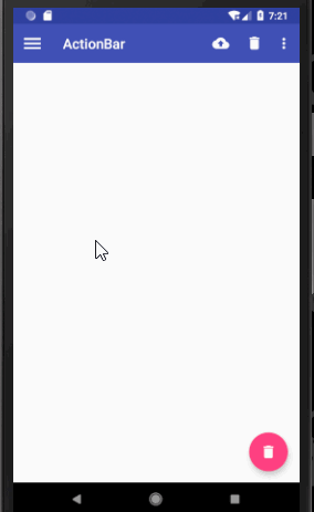
Google按照Materia Design设计提供的滑动菜单中的菜单布局。
xml布局代码:
<?xml version="1.0" encoding="utf-8"?>
<android.support.v4.widget.DrawerLayout
    android:id="@+id/drawer_layout"
    xmlns:android="http://schemas.android.com/apk/res/android"
    xmlns:app="http://schemas.android.com/apk/res-auto"
    xmlns:tools="http://schemas.android.com/tools"
    android:layout_width="match_parent"
    android:layout_height="match_parent"
    tools:context=".Main2Activity">

    <android.support.design.widget.CoordinatorLayout
        android:id="@+id/root"
        android:layout_width="match_parent"
        android:layout_height="match_parent">

        <!--定义theme指定toolBar中的子view的主题,popupTheme指定toolBar隐藏的menu打开时的主题-->
        <android.support.v7.widget.Toolbar
            android:id="@+id/toolBar"
            android:layout_width="match_parent"
            android:layout_height="?attr/actionBarSize"
            android:theme="@style/ThemeOverlay.AppCompat.Dark.ActionBar"
            app:popupTheme="@style/ThemeOverlay.AppCompat.Light"
            android:background="@color/colorPrimary"/>

        <android.support.design.widget.FloatingActionButton
            android:id="@+id/fab"
            android:layout_width="wrap_content"
            android:layout_height="wrap_content"
            android:src="@drawable/ic_delete"
            android:layout_gravity="end|bottom"
            android:layout_margin="16dp"/>
    </android.support.design.widget.CoordinatorLayout>

    <!--headerLayout指定头布局,menu指定头布局下的菜单布局-->
    <android.support.design.widget.NavigationView
        android:layout_width="match_parent"
        android:layout_height="match_parent"
        android:layout_gravity="start"
        app:headerLayout="@layout/nav_header"
        app:menu="@menu/nav_menu"/>
</android.support.v4.widget.DrawerLayout>
java代码
public class Main2Activity extends AppCompatActivity {

    @BindView(R.id.fab)
    FloatingActionButton fab;//悬浮按钮
    @BindView(R.id.toolBar)
    Toolbar toolbar;//toolBar
    @BindView(R.id.drawer_layout)
    DrawerLayout drawerLayout;//滑动菜单

    @Override
    protected void onCreate(Bundle savedInstanceState) {
        super.onCreate(savedInstanceState);
        setContentView(R.layout.activity_main2);
        ButterKnife.bind(this);

        //设置toolBar的title文字
        toolbar.setTitle("ActionBar");
        //将toolBar设置为actionBar
        setSupportActionBar(toolbar);
        ActionBar actionBar = getSupportActionBar();
        //显示返回按钮
        actionBar.setDisplayHomeAsUpEnabled(true);
        //设置返回按钮图标
        actionBar.setHomeAsUpIndicator(R.drawable.ic_menu);

        //设置悬浮按钮点击事件
        fab.setOnClickListener(new View.OnClickListener() {
            @Override
            public void onClick(View v) {

                //构建带点击事件的Snakebar
                Snackbar.make(fab, "Would you want to delete the first item?", Snackbar.LENGTH_SHORT)
                        .setAction("确定", new View.OnClickListener() {
                            @Override
                            public void onClick(View v) {

                                Snackbar.make(fab, "Delete Successful.", Snackbar.LENGTH_SHORT).show();
                            }
                        }).show();
            }
        });
    }

    //设置toolBar上的menu
    @Override
    public boolean onCreateOptionsMenu(Menu menu) {
        getMenuInflater().inflate(R.menu.toolbar, menu);
        return true;
    }

    //点击菜单栏按钮的操作事件
    @Override
    public boolean onOptionsItemSelected(MenuItem item) {
        if (item.getItemId() == android.R.id.home) {
            drawerLayout.openDrawer(GravityCompat.START);
        }
        return true;
    }
}
3.NestedScrollView+CoordinatorLayout+AppBarLayout+ToolBar
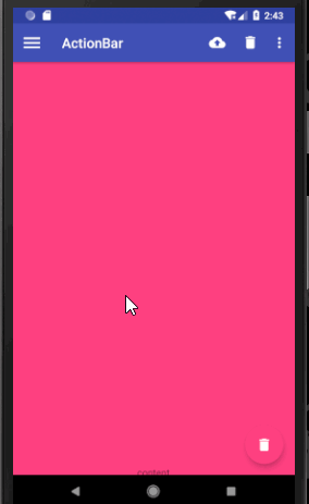
NestedScrollView加强版的ScrollView,支持嵌套滑动,你可以把它就当做ScrollView使用。而Materia Design之所会推出这个滑动布局,一般是配合AppBarLayout+ToolBar来使用的,配合我上一篇文章说道的CoordinateLayout的behavior属性,可以实现ToolBar随着NestedScrollView的向上、向下滑动来进行显示隐藏效果。
AppBarLayout继承自LinearLayout,你可以把它理解为一个垂直方向的LinearLayout,它可以让你定制当某个可滚动View的滚动手势发生变化时,其内部的子View实现何种动作。内部的子View通过在布局中加app:layout_scrollFlags设置执行的动作,值分别为:scroll :子view会跟随滚动事件一起滚动;enterAlways :只要屏幕下滑,view就会立即拉下出来;snap :如果控件下拉了75%的高度,就会自动展开,如果只有25%显示,就会反弹回去关闭;exitUntilCollapsed :当scrollview滑到订部,再将子view折叠起来;
需要注意的是AppBarLayout必须是CoordinatorLayout的子view才有效果。
效果图:注意标题栏的显示隐藏以及出现超过75%时自动展开,小于25%时自动回弹的效果。
xml代码:
<?xml version="1.0" encoding="utf-8"?>
<android.support.v4.widget.DrawerLayout
    android:id="@+id/drawer_layout"
    xmlns:android="http://schemas.android.com/apk/res/android"
    xmlns:app="http://schemas.android.com/apk/res-auto"
    xmlns:tools="http://schemas.android.com/tools"
    android:layout_width="match_parent"
    android:layout_height="match_parent"
    tools:context=".Main2Activity">

    <android.support.design.widget.CoordinatorLayout
        android:id="@+id/root"
        android:layout_width="match_parent"
        android:layout_height="match_parent">

        <android.support.design.widget.AppBarLayout
            android:layout_width="match_parent"
            android:layout_height="wrap_content">
        <!--定义theme指定toolBar中的子view的主题,popupTheme指定toolBar隐藏的menu打开时的主题-->
        <android.support.v7.widget.Toolbar
            android:id="@+id/toolBar"
            android:layout_width="match_parent"
            android:layout_height="?attr/actionBarSize"
            android:theme="@style/ThemeOverlay.AppCompat.Dark.ActionBar"
            app:popupTheme="@style/ThemeOverlay.AppCompat.Light"
            android:background="@color/colorPrimary"
            app:layout_scrollFlags="scroll|enterAlways|snap"/>
        </android.support.design.widget.AppBarLayout>

        <android.support.v4.widget.NestedScrollView
            android:layout_width="match_parent"
            android:layout_height="match_parent"
            app:layout_behavior="@string/appbar_scrolling_view_behavior">
            <FrameLayout
                android:layout_width="match_parent"
                android:layout_height="match_parent">

                <TextView
                    android:layout_width="match_parent"
                    android:layout_height="1200dp"
                    android:text="content"
                    android:gravity="center"
                    android:background="@color/colorAccent"/>
            </FrameLayout>

        </android.support.v4.widget.NestedScrollView>

        <android.support.design.widget.FloatingActionButton
            android:id="@+id/fab"
            android:layout_width="wrap_content"
            android:layout_height="wrap_content"
            android:src="@drawable/ic_delete"
            android:layout_gravity="end|bottom"
            android:layout_margin="16dp"/>
    </android.support.design.widget.CoordinatorLayout>

    <!--headerLayout指定头布局,menu指定头布局下的菜单布局-->
    <android.support.design.widget.NavigationView
        android:layout_width="match_parent"
        android:layout_height="match_parent"
        android:layout_gravity="start"
        app:headerLayout="@layout/nav_header"
        app:menu="@menu/nav_menu"/>
</android.support.v4.widget.DrawerLayout>
4.CardView
卡片布局,可以设置圆角矩形背景和阴影让布局显得更加立体。

xml代码:
<?xml version="1.0" encoding="utf-8"?>
<android.support.v4.widget.DrawerLayout
    android:id="@+id/drawer_layout"
    xmlns:android="http://schemas.android.com/apk/res/android"
    xmlns:app="http://schemas.android.com/apk/res-auto"
    xmlns:tools="http://schemas.android.com/tools"
    android:layout_width="match_parent"
    android:layout_height="match_parent"
    tools:context=".Main2Activity">

    <android.support.design.widget.CoordinatorLayout
        android:id="@+id/root"
        android:layout_width="match_parent"
        android:layout_height="match_parent">

        <android.support.design.widget.AppBarLayout
            android:layout_width="match_parent"
            android:layout_height="wrap_content">
        <!--定义theme指定toolBar中的子view的主题,popupTheme指定toolBar隐藏的menu打开时的主题-->
        <android.support.v7.widget.Toolbar
            android:id="@+id/toolBar"
            android:layout_width="match_parent"
            android:layout_height="?attr/actionBarSize"
            android:theme="@style/ThemeOverlay.AppCompat.Dark.ActionBar"
            app:popupTheme="@style/ThemeOverlay.AppCompat.Light"
            android:background="@color/colorPrimary"
            app:layout_scrollFlags="scroll|enterAlways|snap"/>
        </android.support.design.widget.AppBarLayout>

        <android.support.v4.widget.NestedScrollView
            android:layout_width="match_parent"
            android:layout_height="match_parent"
            app:layout_behavior="@string/appbar_scrolling_view_behavior">
            <FrameLayout
                android:layout_width="match_parent"
                android:layout_height="match_parent">

                <!--cardCornerRadius设置圆角矩形的四个角弧度,elevation设置阴影效果-->
                <android.support.v7.widget.CardView
                    android:layout_width="match_parent"
                    android:layout_height="wrap_content"
                    android:layout_margin="20dp"
                    app:cardCornerRadius="10dp"
                    android:elevation="8dp">

                    <TextView
                        android:layout_width="match_parent"
                        android:layout_height="1200dp"
                        android:text="content"
                        android:gravity="center"
                        android:background="@color/yellow"/>
                </android.support.v7.widget.CardView>
            </FrameLayout>

        </android.support.v4.widget.NestedScrollView>

        <android.support.design.widget.FloatingActionButton
            android:id="@+id/fab"
            android:layout_width="wrap_content"
            android:layout_height="wrap_content"
            android:src="@drawable/ic_delete"
            android:layout_gravity="end|bottom"
            android:layout_margin="16dp"/>
    </android.support.design.widget.CoordinatorLayout>

    <!--headerLayout指定头布局,menu指定头布局下的菜单布局-->
    <android.support.design.widget.NavigationView
        android:layout_width="match_parent"
        android:layout_height="match_parent"
        android:layout_gravity="start"
        app:headerLayout="@layout/nav_header"
        app:menu="@menu/nav_menu"/>
</android.support.v4.widget.DrawerLayout>
5.SwipeRefreshLayout
下拉刷新控件,使用很简单,把它嵌套在你想下拉刷新的布局外面就可以了。

xml布局:
<?xml version="1.0" encoding="utf-8"?>
<android.support.v4.widget.DrawerLayout
    android:id="@+id/drawer_layout"
    xmlns:android="http://schemas.android.com/apk/res/android"
    xmlns:app="http://schemas.android.com/apk/res-auto"
    xmlns:tools="http://schemas.android.com/tools"
    android:layout_width="match_parent"
    android:layout_height="match_parent"
    tools:context=".Main2Activity">

    <android.support.design.widget.CoordinatorLayout
        android:id="@+id/root"
        android:layout_width="match_parent"
        android:layout_height="match_parent">

        <android.support.design.widget.AppBarLayout
            android:layout_width="match_parent"
            android:layout_height="wrap_content">
            <!--定义theme指定toolBar中的子view的主题,popupTheme指定toolBar隐藏的menu打开时的主题-->
            <android.support.v7.widget.Toolbar
                android:id="@+id/toolBar"
                android:layout_width="match_parent"
                android:layout_height="?attr/actionBarSize"
                android:theme="@style/ThemeOverlay.AppCompat.Dark.ActionBar"
                app:popupTheme="@style/ThemeOverlay.AppCompat.Light"
                android:background="@color/colorPrimary"
                app:layout_scrollFlags="scroll|enterAlways|snap"/>
        </android.support.design.widget.AppBarLayout>

        <!--下拉刷新控件-->
        <android.support.v4.widget.SwipeRefreshLayout
            android:id="@+id/swipe_refresh"
            android:layout_width="match_parent"
            android:layout_height="match_parent"
            app:layout_behavior="@string/appbar_scrolling_view_behavior">

            <android.support.v4.widget.NestedScrollView
                android:layout_width="match_parent"
                android:layout_height="match_parent">
                <FrameLayout
                    android:layout_width="match_parent"
                    android:layout_height="match_parent">

                    <!--cardCornerRadius设置圆角矩形的四个角弧度,elevation设置阴影效果-->
                    <android.support.v7.widget.CardView
                        android:layout_width="match_parent"
                        android:layout_height="wrap_content"
                        android:layout_margin="20dp"
                        app:cardCornerRadius="10dp"
                        android:elevation="8dp">

                        <TextView
                            android:layout_width="match_parent"
                            android:layout_height="1200dp"
                            android:text="content"
                            android:gravity="center"
                            android:background="@color/yellow"/>
                    </android.support.v7.widget.CardView>
                </FrameLayout>

            </android.support.v4.widget.NestedScrollView>
        </android.support.v4.widget.SwipeRefreshLayout>

        <android.support.design.widget.FloatingActionButton
            android:id="@+id/fab"
            android:layout_width="wrap_content"
            android:layout_height="wrap_content"
            android:src="@drawable/ic_delete"
            android:layout_gravity="end|bottom"
            android:layout_margin="16dp"/>
    </android.support.design.widget.CoordinatorLayout>

    <!--headerLayout指定头布局,menu指定头布局下的菜单布局-->
    <android.support.design.widget.NavigationView
        android:layout_width="match_parent"
        android:layout_height="match_parent"
        android:layout_gravity="start"
        app:headerLayout="@layout/nav_header"
        app:menu="@menu/nav_menu"/>
</android.support.v4.widget.DrawerLayout>
java代码:
public class Main2Activity extends AppCompatActivity {

    @BindView(R.id.fab)
    FloatingActionButton fab;//悬浮按钮
    @BindView(R.id.toolBar)
    Toolbar toolbar;//toolBar
    @BindView(R.id.drawer_layout)
    DrawerLayout drawerLayout;//滑动菜单
    @BindView(R.id.swipe_refresh)
    SwipeRefreshLayout swipeRefreshLayout;//下来刷新

    @Override
    protected void onCreate(Bundle savedInstanceState) {
        super.onCreate(savedInstanceState);
        setContentView(R.layout.activity_main2);
        ButterKnife.bind(this);

        //设置toolBar的title文字
        toolbar.setTitle("ActionBar");
        //将toolBar设置为actionBar
        setSupportActionBar(toolbar);
        ActionBar actionBar = getSupportActionBar();
        //显示返回按钮
        actionBar.setDisplayHomeAsUpEnabled(true);
        //设置返回按钮图标
        actionBar.setHomeAsUpIndicator(R.drawable.ic_menu);

        //设置悬浮按钮点击事件
        fab.setOnClickListener(new View.OnClickListener() {
            @Override
            public void onClick(View v) {

                //构建带点击事件的Snakebar
                Snackbar.make(fab, "Would you want to delete the first item?", Snackbar.LENGTH_SHORT)
                        .setAction("确定", new View.OnClickListener() {
                            @Override
                            public void onClick(View v) {

                                Snackbar.make(fab, "Delete Successful.", Snackbar.LENGTH_SHORT).show();
                            }
                        }).show();
            }
        });

        //设置下拉刷新事件监听
        swipeRefreshLayout.setOnRefreshListener(new SwipeRefreshLayout.OnRefreshListener() {
            @Override
            public void onRefresh() {

                new Thread(new Runnable() {
                    @Override
                    public void run() {

                        SystemClock.sleep(3000);
                        runOnUiThread(new Runnable() {
                            @Override
                            public void run() {
                                //判断是否正在刷新
                                if (swipeRefreshLayout.isRefreshing()) {
                                    //停止刷新
                                    swipeRefreshLayout.setRefreshing(false);
                                }
                            }
                        });
                    }
                }).start();
            }
        });
    }

    //设置toolBar上的menu
    @Override
    public boolean onCreateOptionsMenu(Menu menu) {
        getMenuInflater().inflate(R.menu.toolbar, menu);
        return true;
    }

    //点击菜单栏按钮的操作事件
    @Override
    public boolean onOptionsItemSelected(MenuItem item) {
        if (item.getItemId() == android.R.id.home) {
            drawerLayout.openDrawer(GravityCompat.START);
        }
        return true;
    }
}
6.CollapsingToolbarLayout
CollapsingToolbarLayout作用是提供了一个可以折叠的Toolbar,它继承自FrameLayout。
CollapsingToolbarLayout属性 含义
app:title 设置标题
app:collapsedTitleGravity="center" 设置标题位置
app:contentScrim 设置折叠时toolbar的颜色,默认是colorPrimary的色值
app:statusBarScrim 设置折叠时状态栏的颜色 ,默认是colorPrimaryDark的色值
app:layout_collapseParallaxMultiplier 设置视差
app:layout_collapseMode="parallax" 视差模式,在折叠的时候会有个视差折叠的效果
app:layout_collapseMode="pin" 固定模式,在折叠的时候最后固定在顶端
需要注意的是CollapsingToolbarLayout没有限制里面的内容必须是toolBar,但是它必须作为AppBarLayout的子view来使用才有效果。

xml代码:
<?xml version="1.0" encoding="utf-8"?>
<android.support.v4.widget.DrawerLayout
    android:id="@+id/drawer_layout"
    xmlns:android="http://schemas.android.com/apk/res/android"
    xmlns:app="http://schemas.android.com/apk/res-auto"
    xmlns:tools="http://schemas.android.com/tools"
    android:layout_width="match_parent"
    android:layout_height="match_parent"
    tools:context=".Main2Activity">

    <android.support.design.widget.CoordinatorLayout
        android:id="@+id/root"
        android:layout_width="match_parent"
        android:layout_height="match_parent">

        <android.support.design.widget.AppBarLayout
            android:layout_width="match_parent"
            android:layout_height="wrap_content">

            <!--可折叠菜单-->
            <android.support.design.widget.CollapsingToolbarLayout
                android:layout_width="match_parent"
                android:layout_height="wrap_content"
                app:layout_scrollFlags="scroll|exitUntilCollapsed"
                android:theme="@style/ThemeOverlay.AppCompat.Dark.ActionBar"
                app:popupTheme="@style/ThemeOverlay.AppCompat.Light"
                app:contentScrim="@color/colorPrimary">

                <ImageView
                    android:layout_width="match_parent"
                    android:layout_height="250dp"
                    android:src="@drawable/apple"
                    android:scaleType="fitXY"
                    app:layout_collapseMode="parallax"/>

                <!--定义theme指定toolBar中的子view的主题,popupTheme指定toolBar隐藏的menu打开时的主题-->
                <android.support.v7.widget.Toolbar
                    android:id="@+id/toolBar"
                    android:layout_width="match_parent"
                    android:layout_height="?attr/actionBarSize"
                    app:layout_collapseMode="pin"/>
            </android.support.design.widget.CollapsingToolbarLayout>
        </android.support.design.widget.AppBarLayout>

        <!--下拉刷新控件-->
        <android.support.v4.widget.SwipeRefreshLayout
            android:id="@+id/swipe_refresh"
            android:layout_width="match_parent"
            android:layout_height="match_parent"
            app:layout_behavior="@string/appbar_scrolling_view_behavior">

            <android.support.v4.widget.NestedScrollView
                android:layout_width="match_parent"
                android:layout_height="match_parent">
                <FrameLayout
                    android:layout_width="match_parent"
                    android:layout_height="match_parent">

                    <!--cardCornerRadius设置圆角矩形的四个角弧度,elevation设置阴影效果-->
                    <android.support.v7.widget.CardView
                        android:layout_width="match_parent"
                        android:layout_height="wrap_content"
                        android:layout_margin="20dp"
                        app:cardCornerRadius="10dp"
                        android:elevation="8dp">

                        <TextView
                            android:layout_width="match_parent"
                            android:layout_height="1200dp"
                            android:text="content"
                            android:gravity="center"
                            android:background="@color/yellow"/>
                    </android.support.v7.widget.CardView>
                </FrameLayout>

            </android.support.v4.widget.NestedScrollView>
        </android.support.v4.widget.SwipeRefreshLayout>

        <android.support.design.widget.FloatingActionButton
            android:id="@+id/fab"
            android:layout_width="wrap_content"
            android:layout_height="wrap_content"
            android:src="@drawable/ic_delete"
            android:layout_gravity="end|bottom"
            android:layout_margin="16dp"/>
    </android.support.design.widget.CoordinatorLayout>

    <!--headerLayout指定头布局,menu指定头布局下的菜单布局-->
    <android.support.design.widget.NavigationView
        android:layout_width="match_parent"
        android:layout_height="match_parent"
        android:layout_gravity="start"
        app:headerLayout="@layout/nav_header"
        app:menu="@menu/nav_menu"/>
</android.support.v4.widget.DrawerLayout>
当然了,上面的效果不那么完美,状态栏还在,我们想实现的可能是这样的:

在android21及以上实现起来也很简单,新建values-v21目录然后新建styles.xml文件,在里面设置主题中的statusBarColor为透明,然后把这个主题设置给activity,并在xml布局中将imageview以及他的所有父布局都设置android:fitsSystemWindows="true"属性就可以了。
values目录下的styles.xml代码:
<resources>

    <!-- Base application theme. -->
    <style name="AppTheme" parent="Theme.AppCompat.Light.NoActionBar">
        <!-- Customize your theme here. -->
        <item name="colorPrimary">@color/colorPrimary</item>
        <item name="colorPrimaryDark">@color/colorPrimaryDark</item>
        <item name="colorAccent">@color/colorAccent</item>
    </style>

    <style name="FruitActivityStyle" parent="AppTheme"/>

</resources>
values-v21下的 styles.xml代码:
<?xml version="1.0" encoding="utf-8"?>
<resources>

    <style name="FruitActivityStyle" parent="AppTheme">
        <item name="android:statusBarColor">@android:color/transparent</item>
    </style>

</resources>
清单配置文件代码:
<activity android:name=".Main2Activity"
            android:launchMode="singleTask"
            android:theme="@style/FruitActivityStyle">
            <intent-filter>
                <action android:name="android.intent.action.MAIN" />

                <category android:name="android.intent.category.LAUNCHER" />
            </intent-filter>
        </activity>
xml布局代码:
<?xml version="1.0" encoding="utf-8"?>
<android.support.v4.widget.DrawerLayout
    android:id="@+id/drawer_layout"
    xmlns:android="http://schemas.android.com/apk/res/android"
    xmlns:app="http://schemas.android.com/apk/res-auto"
    xmlns:tools="http://schemas.android.com/tools"
    android:layout_width="match_parent"
    android:layout_height="match_parent"
    tools:context=".Main2Activity"
    android:fitsSystemWindows="true">

    <android.support.design.widget.CoordinatorLayout
        android:id="@+id/root"
        android:layout_width="match_parent"
        android:layout_height="match_parent"
        android:fitsSystemWindows="true">

        <android.support.design.widget.AppBarLayout
            android:layout_width="match_parent"
            android:layout_height="250dp"
            android:fitsSystemWindows="true">

            <!--可折叠菜单-->
            <android.support.design.widget.CollapsingToolbarLayout
                android:layout_width="match_parent"
                android:layout_height="wrap_content"
                app:layout_scrollFlags="scroll|exitUntilCollapsed"
                android:theme="@style/ThemeOverlay.AppCompat.Dark.ActionBar"
                app:popupTheme="@style/ThemeOverlay.AppCompat.Light"
                app:contentScrim="@color/colorPrimary"
                android:fitsSystemWindows="true">

                <ImageView
                    android:layout_width="match_parent"
                    android:layout_height="250dp"
                    android:src="@drawable/apple"
                    android:scaleType="fitXY"
                    android:fitsSystemWindows="true"
                    app:layout_collapseMode="parallax"/>

                <!--定义theme指定toolBar中的子view的主题,popupTheme指定toolBar隐藏的menu打开时的主题-->
                <android.support.v7.widget.Toolbar
                    android:id="@+id/toolBar"
                    android:layout_width="match_parent"
                    android:layout_height="?attr/actionBarSize"
                    app:layout_collapseMode="pin"/>
            </android.support.design.widget.CollapsingToolbarLayout>
        </android.support.design.widget.AppBarLayout>

        <!--下拉刷新控件-->
        <android.support.v4.widget.SwipeRefreshLayout
            android:id="@+id/swipe_refresh"
            android:layout_width="match_parent"
            android:layout_height="match_parent"
            app:layout_behavior="@string/appbar_scrolling_view_behavior">

            <android.support.v4.widget.NestedScrollView
                android:layout_width="match_parent"
                android:layout_height="match_parent">
                <FrameLayout
                    android:layout_width="match_parent"
                    android:layout_height="match_parent">

                    <!--cardCornerRadius设置圆角矩形的四个角弧度,elevation设置阴影效果-->
                    <android.support.v7.widget.CardView
                        android:layout_width="match_parent"
                        android:layout_height="wrap_content"
                        android:layout_margin="20dp"
                        app:cardCornerRadius="10dp"
                        android:elevation="8dp">

                        <TextView
                            android:layout_width="match_parent"
                            android:layout_height="1200dp"
                            android:text="content"
                            android:gravity="center"
                            android:background="@color/yellow"/>
                    </android.support.v7.widget.CardView>
                </FrameLayout>

            </android.support.v4.widget.NestedScrollView>
        </android.support.v4.widget.SwipeRefreshLayout>

        <android.support.design.widget.FloatingActionButton
            android:id="@+id/fab"
            android:layout_width="wrap_content"
            android:layout_height="wrap_content"
            android:src="@drawable/ic_delete"
            android:layout_gravity="end|bottom"
            android:layout_margin="16dp"/>
    </android.support.design.widget.CoordinatorLayout>

    <!--headerLayout指定头布局,menu指定头布局下的菜单布局-->
    <android.support.design.widget.NavigationView
        android:layout_width="match_parent"
        android:layout_height="match_parent"
        android:layout_gravity="start"
        app:headerLayout="@layout/nav_header"
        app:menu="@menu/nav_menu"/>
</android.support.v4.widget.DrawerLayout>
智能推荐
在浏览器地址栏输入URL并按下回车后,发生了什么?DNS?UDP?TCP?_浏览器向dns服务器发出域名解析请求并获得结果②在浏览器中输入url并按下回车键-程序员宅基地
文章浏览阅读655次。例如:在浏览器地址栏输入www.taobao.com,按下回车,发生了什么?1. 浏览器会进行DNS域名解析,拿到域名对应的服务器ip地址,再用该ip去访问web服务器DNS域名解析的过程:1.将待解析的域名放入DNS请求报文,以UDP报文段方式发给本地域名服务器2.若本地域名服务器有查找到域名映射的信息,则把对应的IP地址放在响应报文中返回3.若本地域名服务器没有查找到映射的信息,则会..._浏览器向dns服务器发出域名解析请求并获得结果②在浏览器中输入url并按下回车键
Shell_[root@hadoop1 ~]里面为啥不是shell-程序员宅基地
文章浏览阅读106次。大数据程序员为什么要学习Shell呢?(脚本开发)1)需要看懂运维人员编写的Shell程序。2)偶尔会编写一些简单Shell程序来管理集群、提高开发效率。第2章 Shell解析器(1)Linux提供的Shell解析器有:[shell@hadoop101 ~]$ cat /etc/shells/bin/sh/bin/bash(常用解析器)/sbin/nologin/bin/dash..._[root@hadoop1 ~]里面为啥不是shell
dcs world f15c教学_新概念英语 | 第二册(Lesson 93)教学视频/课文音频/精讲笔记...-程序员宅基地
文章浏览阅读227次。点击 上 方蓝 字关注 我 们教学视频?Lesson 93A noble gift崇高的礼物First listen and then answer the question.听录音,然后回答以下问题。Where was the Statue of Liberty made?One of the most famous monuments in the world, the St..._the great monument has been a symbol of liberty for the municipal court
浏览器工作原理及页面加载的优化建议_b端加载页-程序员宅基地
文章浏览阅读1.4k次。B/S架构,B端的大部分载体是浏览器,浏览器的主要功能是把用户请求的web资源呈现出来,它请求服务器资源,并将其显示在浏览器窗口,资源的格式通常有HTML,PDF,及其他格式。浏览器的主要构成High Level Structure浏览器的主要组件包括:1. 用户界面- 包括地址栏、后退/前进按钮、书签目录等,也就是你所看到的除了用来显示你所请求页面的主窗口之外的其他部分2_b端加载页
他破解了iPhone和PS3 引发了黑客战争-程序员宅基地
文章浏览阅读188次。2007年夏季,世界上的第一台iPhone闪亮登场。但在它问世没多久后,就被天才小子——乔治·霍兹(George Hotz)破解了。苹果公司在发布iPhone的时候,是以AT&T合约机的形式发布的,也就是说iPhone的用户只能使用AT&T公司的网络服务,而霍兹是T-mobile的用户,他想对手上的iPhone进行改装,让其也能够在T-mobile的网络下使用。没有什么能够难倒我们...
金三银四,想拿高薪?你该如何制作一份令人满意的简历?-程序员宅基地
文章浏览阅读83次。经历过秋招的同学一定知道竞争有多激烈,春招的竞争激烈程度并不亚于秋招。因为国考、考研失利的部分同学会成为竞争者中的一员,已经拿到offer的同学也会因为想得到更好的机会而参加。除了竞争人数多以外,作为补招,职位也没有秋招丰富,难免出现僧多粥少的局面。说了这么多,如何才能在春招里突出重围呢?今天乐字节fafa给大家支招,从工作的敲门砖——简历入手,教大家如何制作出一份令人满意的简历。1.简历定位简历定位就是要按照与以上岗位要求相关的内容来开始给自己画一个像,做个定位,履历内容紧贴定位。面试人力资源,就
随便推点
图像处理和计算机视觉中的经典论文(部分)_论文阅读 图像处理csdn-程序员宅基地
文章浏览阅读1.3k次。本文转载自:xdyang的图像视觉小屋http://blog.csdn.net/dcraw/article/details/7367990,非常感谢!!自己视野狭小,不敢说全部,只是把自己熟悉的方向中的部分经典文章列出来了。经典的论文,读得怎么透都不过分。有人说关于配准的文章太多了,其实我也不太关注这方面,不过由于它们引用率都比较高,就都列出来了,不过在zip包里一篇都没有。不_论文阅读 图像处理csdn
LeNet、AlexNet、GoogLeNet、VGG、ResNetInception-ResNet-v2、FractalNet、DenseNet_伯克利大学evan shelhamer等人利用已有深度学习模型(alexnet、vgg、google-程序员宅基地
文章浏览阅读1.8w次,点赞3次,收藏37次。2006年Hinton他们的Science Paper再次引起人工神经网络的热潮,当时提到,2006年虽然Deep Learning的概念被提出来了,但是学术界的大家还是表示不服。当时有流传的段子是Hinton的学生在台上讲paper时,台下的机器学习大牛们不屑一顾,质问你们的东西有理论推导吗?有数学基础吗?搞得过SVM之类吗?回头来看,就算是真的,大牛们也确实不算无理取闹,是骡子是马拉出来遛遛,_伯克利大学evan shelhamer等人利用已有深度学习模型(alexnet、vgg、googlenet),通
javascript函数柯里化及应用-程序员宅基地
文章浏览阅读95次。柯里化是把接受多个参数的函数变换成接受一个单一参数的函数,并且返回一个新函数,这个新函数能够接受原函数的参数。下面可以通过例子来帮助理解。function adder(num) { return function(x) { return num + x; }}var add5 = adder(5);var add6 = adder(6);print(add5(1...
前端部署实战(阿里云服务器+nginx)_阿里云 nginx-程序员宅基地
文章浏览阅读1.8k次,点赞2次,收藏14次。获得自己的服务器后,打开云服务器ECS控制台,在实例中找到自己服务器,点击远程连接,选择通过WorkBench远程连接。开始之间需要安装xshell用于连接服务器,安装xftp用于上传文件,安装完毕后打开xshell,新建一个会话,主机填服务器的公网地址,可在阿里云实例页面查看,填好后点击确定。qiankundemo的主应用和子应用均部署在同一个服务器上,主应用中子应用的配置如下,entry设置为环境变量,开发和部署时分别指向不同的入口,打开服务器公网地址,出现以下页面,说明nginx启动成功。_阿里云 nginx
Python DataFrame时间序列数据(Pandas篇-22)-程序员宅基地
文章浏览阅读1.1k次,点赞33次,收藏18次。Python Pandas 时间序列数据。
篇章结构类型、层次及分析模式研究-程序员宅基地
文章浏览阅读1w次,点赞4次,收藏6次。这篇是何继红、张德禄一篇发表在《外语与外语教学》上的一篇论文,本文是其个人读后感和一些想法。1. 摘要这篇文章中,主要针对的是语篇结构和类型、层级性和分析模式的研究,着重对于语篇的结构类型进行了相关的探讨。我也主要是注重其语篇的结构方面进行相关的思考。2. 语篇、话语与篇章语篇(text)和话语(discourse)、篇章(discourse)之间有着一定的联系。在系统功能语言学中,语篇和话语没有什_篇章结构